CSV to Chart & Graph Tools
Transform spreadsheet data into beautiful visual charts and graphs instantly. Perfect for reports, presentations, and data analysis.
Visualize CSV to Image
Import CSV to create comparison bars image
CSV to Bar
Import CSV to create bar image
CSV to Chart
Import CSV to create Infographic customizable chart

CSV to Grid Comparison Image
Import CSV to create Grid comparison Image
CSV to scale chart comparison
Create Stunning Data Visualizations by scale in Minutes
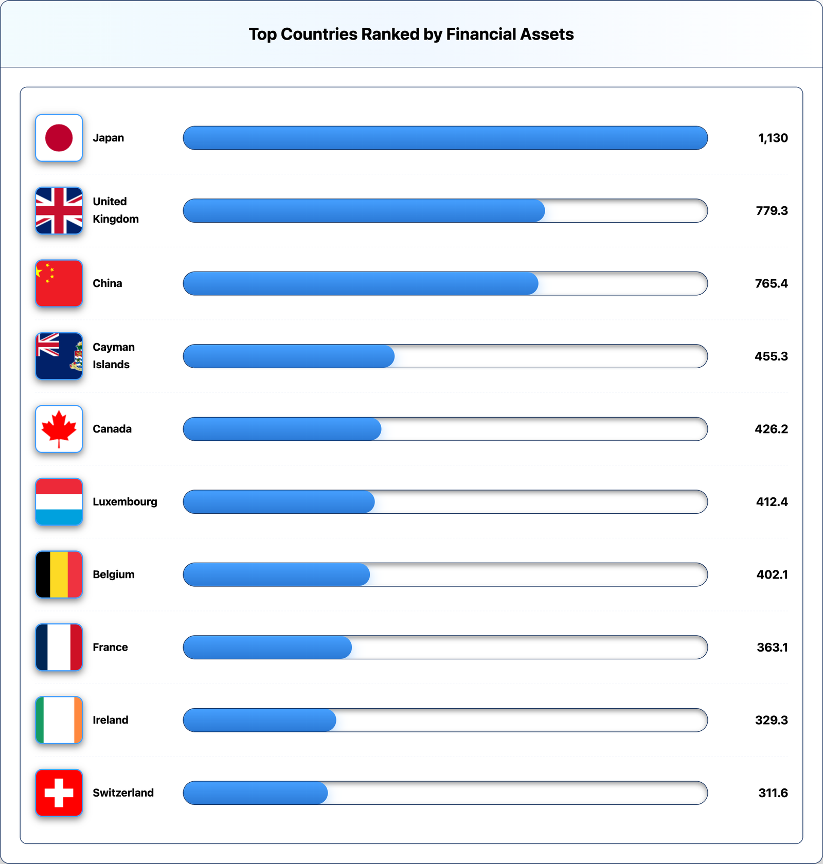
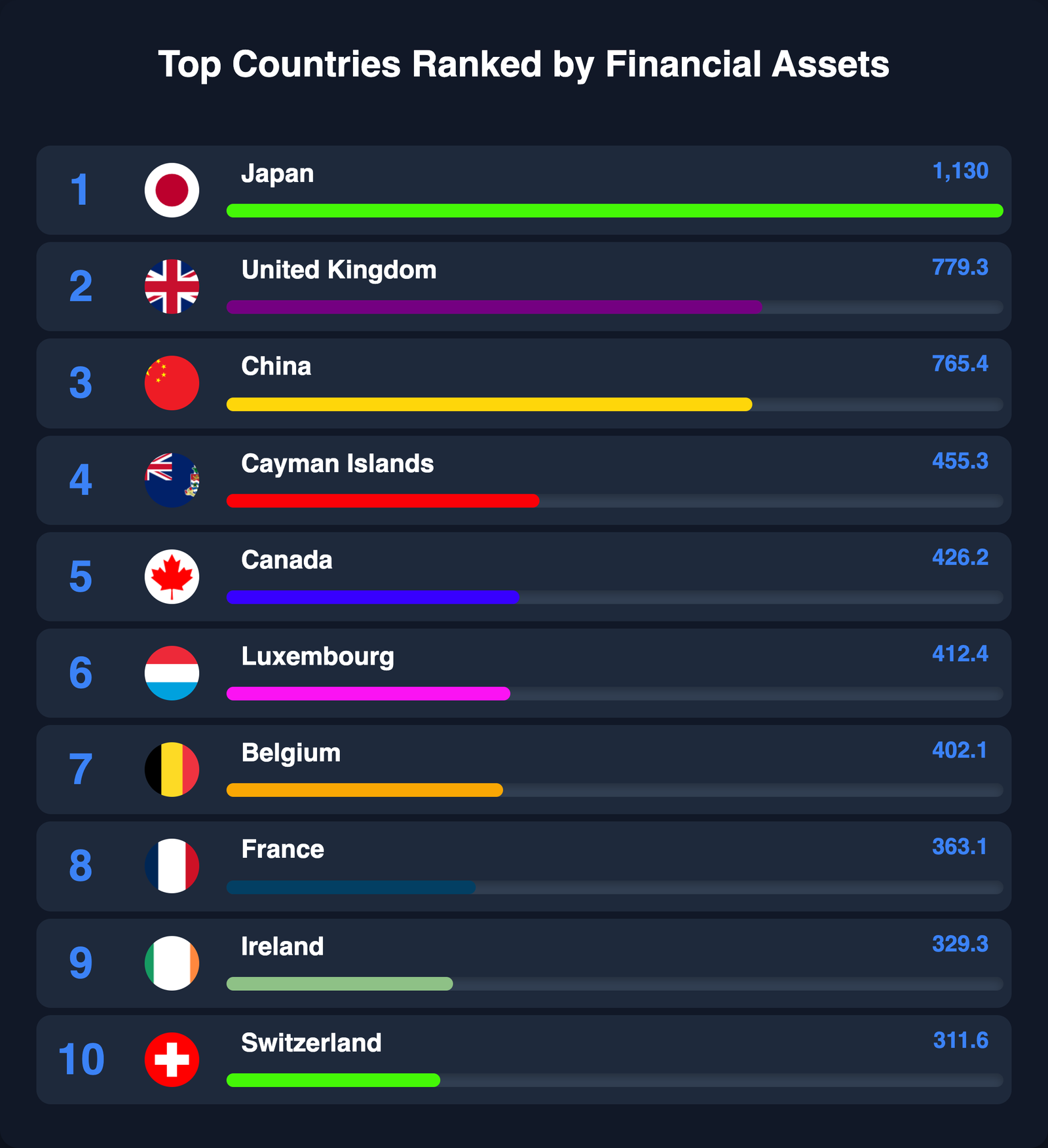
Ranking & Data Infographics
Create eye-catching ranking lists and comparison graphics. Perfect for top 10 lists, leaderboards, and comparative analysis.
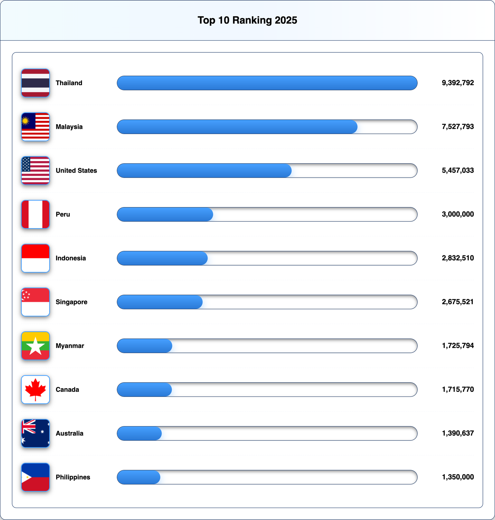
Ranking Infographic Generator
Import CSV to create Ranking Infographic
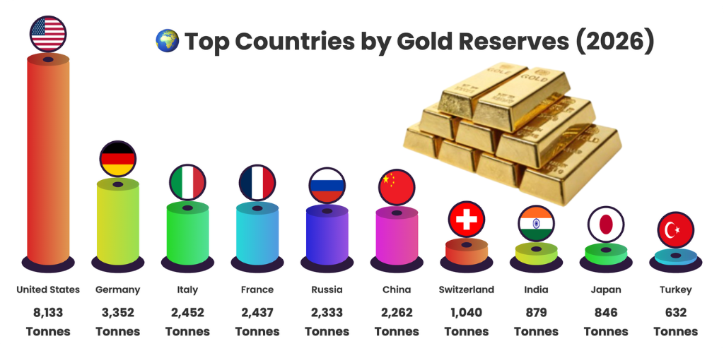
Universal Ranking Generator
Create 3D Comparison ranking from CSV
Top 10 infographics creator
Create top 10 data infographics

Free Social Media Post Design Tool
Create Instagram & Facebook Posts Like Startup Pakistan

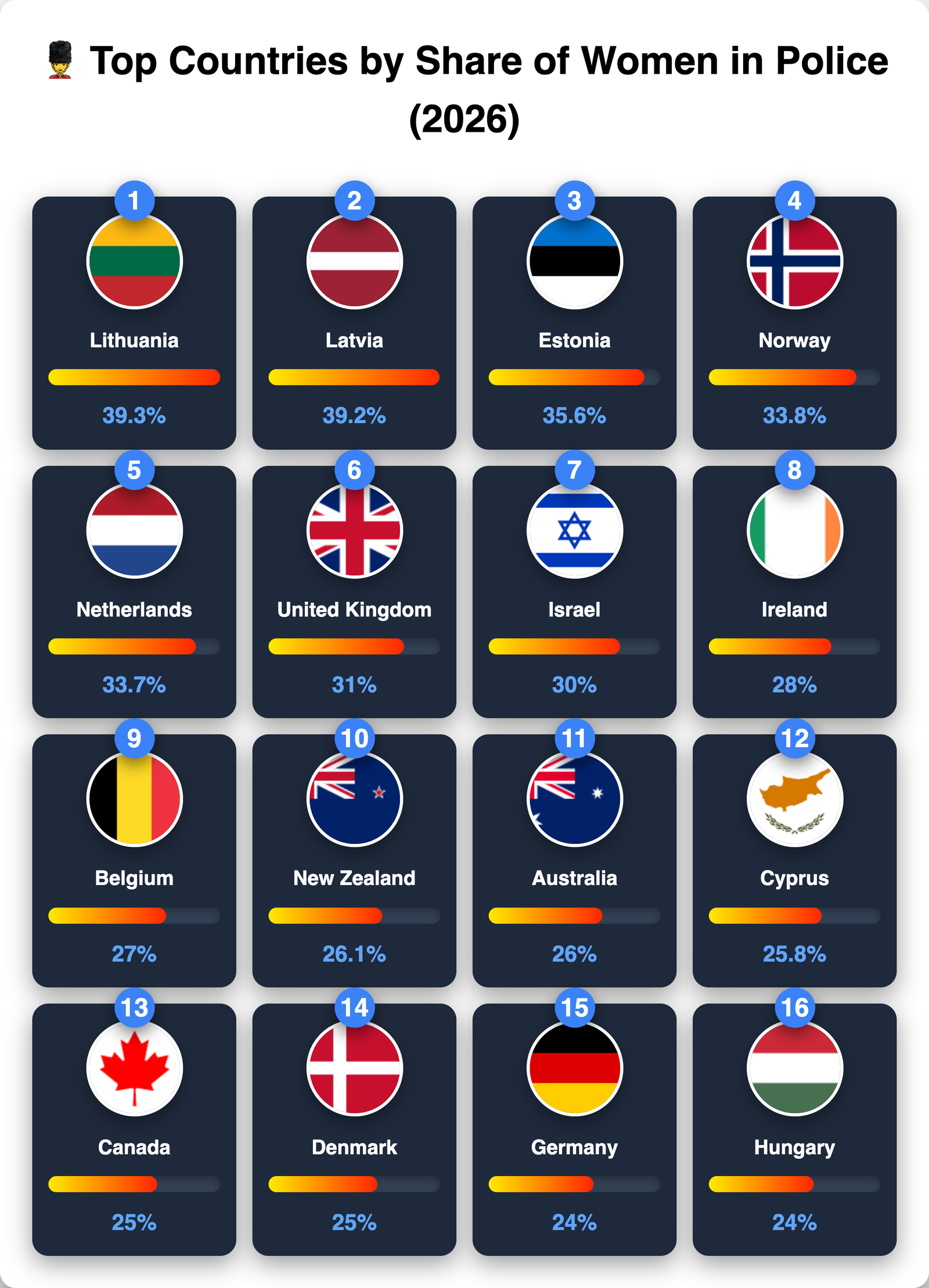
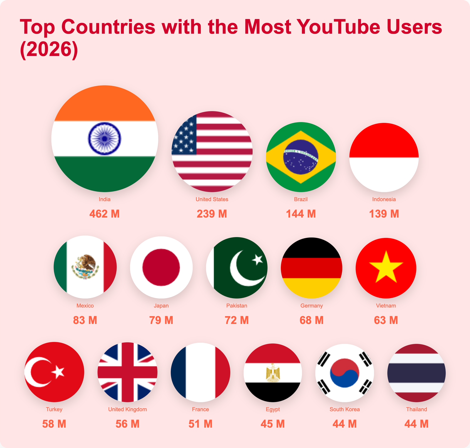
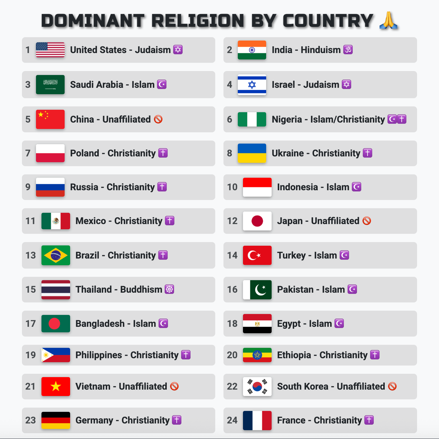
Country Infographic Generator
Create Custom Flag Infographics
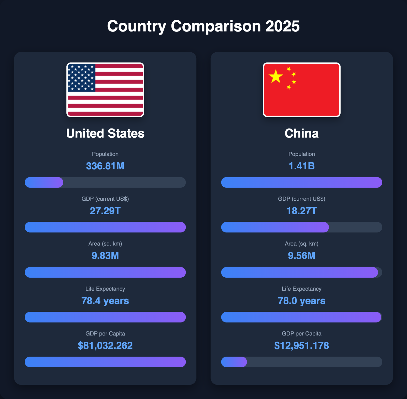
Country & Geographic Comparisons
Compare countries with flags, data, and beautiful visualizations. Ideal for geographic analysis, international statistics, and educational content.
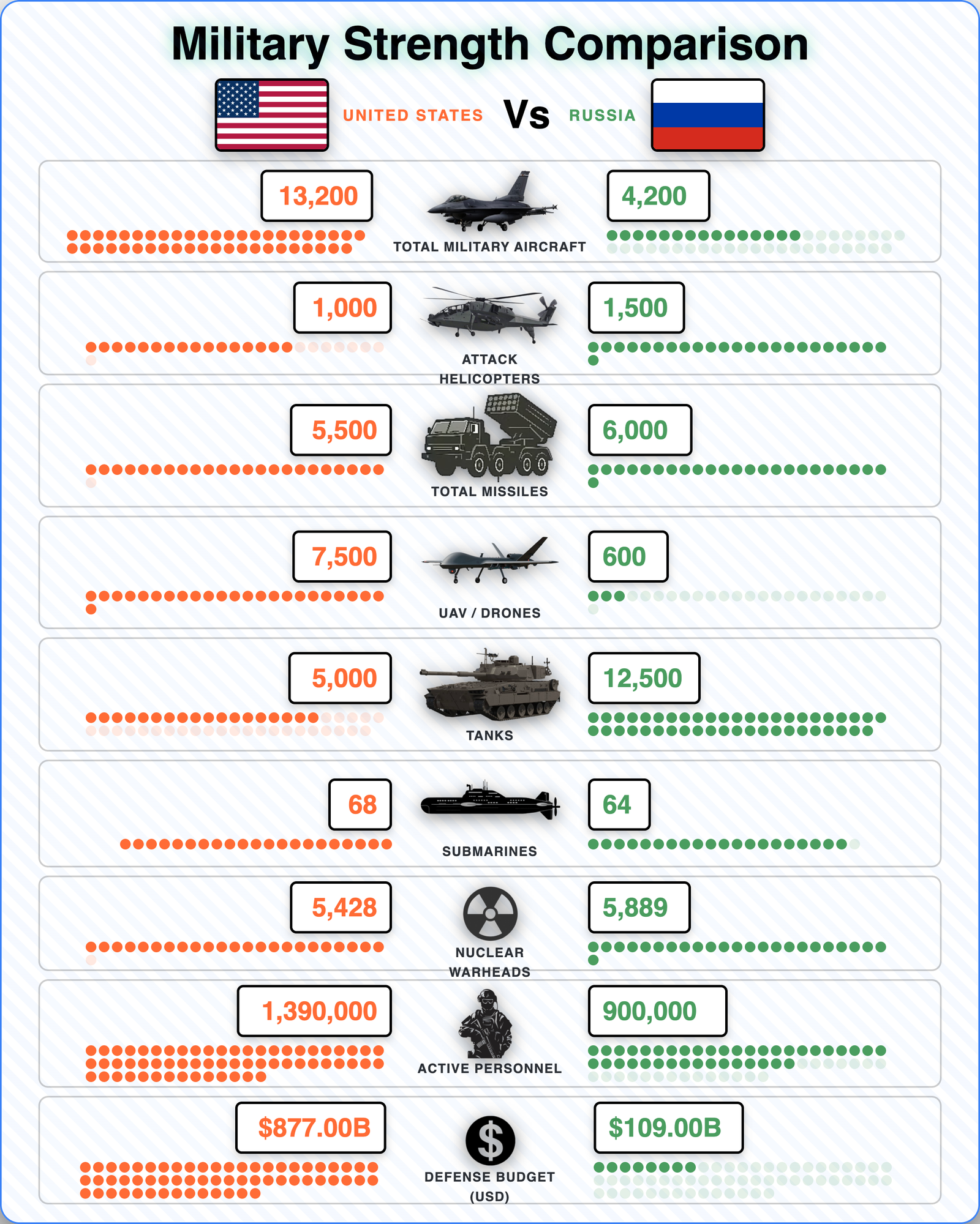
Military & Specialized Comparisons
Create detailed military and defense comparisons with specialized templates and data fields.

Mobile & Video Tools
Additional comparison and utility tools for mobile devices and video content.